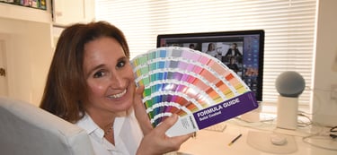
Characteristics of Colour
Colour makes an impact, all of which can create positive as well as negative reactions.
Colours hold key characteristics. They can create mood change, judgements and emotions. All colours have a host of historical associations, cultural context, commercial representations and visual impact. Think of a strong maroon colour to a soft pale blue, and you'll immediately feel the intensity of the red compared to the tranquility of the blue.
In my world of graphic design, at Mary Till Design, for every client they'll be a natural direction as to the colour they'll use. It'll be based on their personality, character and the service or business they represent. The colour will communicate to their target audience and create an immediate impact in it's appeal.
I once designed for Benson & Hedges while working at Interbrand. The cigarette brand had to be adapted for the Arab world. And gold in the Arab culture is absolutely key. In the western world, sophisticated gold is more platinum in tone, cooler in its yellow hues and more respected as a softer subtle version. Yet in the Arab world - the more golden, the better - the stronger the yellow content in the gold - the more it appeals to Arabs. One thinks of the different weather patterns in the UAE as opposed to Western Europe - the sun intensifies colours in all areas - particularly in gold which reflects the light and therefore intensifies the yellow - they are used to this rich looking gold and associate wealth and success to it. This understanding of the target market was really important as we developed the B&H brand.
A couple of years ago I designed some wholesale sugar packaging that came from Guatemala and was to be sold in Africa. Another cultural challenge of colour choice. The colours in the design needed to represent Guetemala while at the same time appeal to the Africans. A different cultural context, enhanced by their respective environment and colour associations. Red, green and yellows shone through from both these continents. Interestingly they lie on similar latitude lines and encounter similar weather conditions. Obviously the lush green is inspired by their trees, the intense blue by the surrounding skies and waters, the reds from the tropical birds and flowers. And consequently the colours seep into the culture of the people and become a natural visual language.


Characteristics of Colour
black
Represents unquestioned authority - think of a policemen's uniform.
But too much of it can create a sense of overbearing.
grey
Can create a calm focus, but too much can be dreary and bland.
purple
Can create a spiritual awareness - hence the Roman Emperor Nero using it as his exclusive colour for royalty.
However, too much of the colour can be oppressively introspective.
green
Balance and peace - nature's robes - and a colour that requires the eye to work the least - it is literally 'restful on the eye'. However, too much of it and the wrong type of green can feel heavy, unproductive and stagnant - just like an overgrown pond.
blue
Intellectual, knowledgable and responsible. A trustworthy colour that is powerful and thought-provoking. However, too much and it can be cold, unapproachable and stiff in nature.
brown
A grounded colour, down to earth (literally), a strong, reliable, dependable and supportive colour.
But too much of it and it becomes too sad, serious and isolated.
orange
Represents a warm bravery. A bold joy with a twist of fun. Sunshine, enthusiasm, creativity, determination, success, freedom and expression. Too much of it however can come across as too light hearted and immature.
yellow
Represents a sunny disposition. Optimism, energy, joy, friendship and a lifting of one's spirit.
However, the flip side is that it can make one feel anxious, jealous, ill or irritable.
pink
Represents love, kindness, playfulness and good health. Too much pink can suggest a neediness, weakness and being overly emotional.
red
Red is energy, vigor, passion, courage and love.
However, on the flip side it can represent anger, danger and aggression.
I've always found colour fascinating. I choose the colour of my clothes according to how I am feeling or how I'd like to be perceived to be feeling. The colours in my house are key to peoples moods and energy levels. In my garden I designed a 'red hot' garden in an area by a terrace that was perfect for evening parties. And in contrast a soft 'pinks, lilacs and white' garden to create a softer, calmer, more romantic country garden feel around the relaxing pool.
Follow me on instagram
@marytilldesign
or join me through
www.marytilldesign.com
or simply email me at
hello@marytilldesign.co.uk
Mary Till can consider, create and design your logo, website, packaging, books, brochures, signage and branding.
Mary works direct with clients for all types of industries. She loves delving into the true essence of a business to really grasp how it should be best represented visually.
Join Mary Till on her talk about branding and colours online at The Decorcafe on 25th August 2021.
Alternatively you might like to become a member of the community of creative designers, original products and skilled services at TheDecorcafe.
https://thedecorcafe.com/shop/the-decorcafe-membership-hosted-by-mary-till/


